Tuesday, 16 July 2013

Tunnel Textures and some details

Still powering through some of the textures and shaders. The tunnel one is the same as the walls (as you can see). But it was a little difficult to UV map because of the shape. After that was sorted it is looking good. However, I might be overusing that tile shader a bit. Maybe it doesnt need to run all the way down the tunnel?
Some of the lighting is temporary, purely to see how the shader on the tunnel is looking

Monday, 15 July 2013

High Res

Just a test of the resolution I will be outputting the final image to.

Thursday, 11 July 2013

Steps, Door and sign texturing

So I have been creating some more textures for the scene. Most I have briefly outlined below but I have also started on the train itself which might prove to be a little difficult just because of the amount of different materials it is made of. Next things to do would be the concrete sections either side of the stairs and the wall where the blue door is.

The door shader consists of a diffuse, spec and bump map.

The steps were actually made using multiple shaders linked together with the layered shader node. Yellow strips with an alpha map to reveal concrete consisting of a diffuse and normal map underneath.
Current state of the scene. Starting to add a few details here and there is really bringing the scene to life.


Thursday, 4 July 2013

Underground Texturing & Lighting

Current state of the underground scene so far.

The lighting for the vending machine is temporary. I want to get a better effect like the light is actually coming through the plastic front panel. I also used 4 lights to light the front of the vending machine which is quite expensive scene wise but gives off the look that there are multiple bulbs inside. There might be a better way to achieve that effect without all 4 lights though.
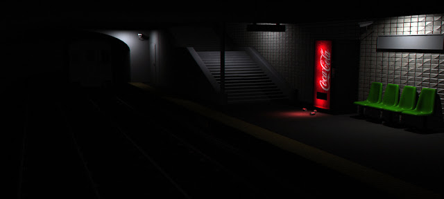
The image has some post work on it such as grain and chromatic abberation.

The studded texture towards the edge of the platform has been changed. It is a lot more realistic as it was sourced from concrete studs were as before it was metal so it didn't look quite right.
I am liking the lighting towards the right of the image. I have been balancing too much and too little light and trying to encompass some of the details like the security camera but without too many lights.
I have also used the soft select tool on the stairs to make them not so perfectly straight lines which helps bring more realism into it and break up the lines.