Amy:
She has nicely made me a logo with a good old cliched american diner name. Sweet

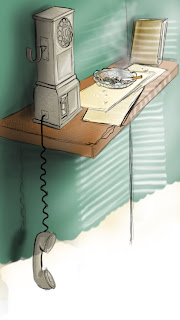
A good piece of concept showing the harsh blind shadows and generally the dark ish lighting.


Hollie:
Bit more colorful and detailed shots of possible settings for the phone area.

Although the blue is not my idea for the colour of the background its a nice stool, with slightly ripped leather, Ideally the stool would be slightly more burgundy, but the rust is good, not too much or too little.


No comments:
Post a Comment